Calgary Transit
Crafting an experience for 103 million passengers
Calgary Transit, servicing a substantial 103 million passengers annually, plays a pivotal role in Calgary's urban narrative. Its impact extends beyond efficient commuting to capturing the essence of the city through the individual stories it carries. In the fall of 2018, Calgary Transit issued an RFP to usher in a Mobile Ticketing Solution (MTS) aligned with its vision of introducing app-based fare payment. The selected solution needed to be account-based with CRM features, ensuring a secure, convenient, and reliable system. Long-term goals aimed for seamless integration with other city-approved transit providers.
The goal of this project was to assess the effectiveness and user experience of the MTS. Spanning approximately one month, the project incorporated field testing, prototype development, usability testing, and the creation of marketing materials. We aimed to gather insights on plain language, material reliability perceptions, user expectations, and aesthetic considerations such as visuals, typography, and iconography. The City of Calgary anticipated valuable insights into user expectations, material perceptions, and aesthetic considerations to inform future advancements in transit technology.
In collaboration with the Calgary Transit and Mount Royal University
Phase 1: Discovery
Field Testing
Kicking off with a field test of a beta version of an MTS called MyFare, the initial phase involved collecting data on the app's success, efficiency, and user satisfaction. These insights served as a crucial foundation for developing low and high-fidelity prototypes, incorporating additional features based on user feedback.
Conducting a field test on route #38 Brentwood/Temple, the app's usability was assessed, revealing a fairly user-friendly experience in purchasing and activating tickets. The efficient process and simple interface were highlighted, with insights into improving user flow, aesthetics and applying design principles. Identified areas for improvement included adding information about routes featuring MTS, incorporating transfer options, U-Pass/Senior Pass integration, and optimizing the menu layout for enhanced usability. The overall conclusion emphasized the app's simplicity, ease of use, acknowledging its user-friendly nature with potential areas for enhancement.
We identified the following major issues:
✘ Aesthetics & Branding
✘ Navigation
✘ Usability & Accessibiity
✘ Language
✘ Iconography
✘ Efficiency
✘ U-Pass/Senior Pass
✘ Ease of Use
✘ Compatibility
✘ Integration with Apps/CT Information
✘ One Stop Shop
✘ Transit Timings
✘ Participating Routes
Landscape Review
We further conducted extensive desk research and a landscape review to gather insights from real-world examples of successful implementations in other cities. By analyzing various transit systems globally that have embraced mobile ticketing solutions, the team sought inspiration to enhance the functionality and user experience of Calgary Transit's MTS.
Successful implementations of Mobile Ticketing Solutions (MTS) in cities like London, New York, and Berlin were identified as precedents for key elements contributing to their effectiveness
✘ User-Friendly Interface
London's Oyster card system and New York's MTA eTix app excel in providing intuitive, user-friendly interfaces. Clear navigation, easy ticket purchasing, and straightforward activation contribute to a positive user experience.
✘ Comprehensive Information
Both London and New York incorporate comprehensive information within their MTS apps, including real-time transit schedules, route maps, and service updates. This ensures users have all the information they need for a seamless journey.
✘ Integration with Transit Ecosystem
Berlin's BVG app integrates various transit modes, such as buses, trains, and trams, offering users a holistic view of the city's transit ecosystem. Integration with multiple transportation options enhances the convenience of the MTS.
✘ Accessibility Features
The transit systems in London, New York, and Berlin prioritize accessibility features to cater to diverse user needs. Clear visual cues, multiple language options, and features accommodating individuals with disabilities contribute to an inclusive MTS experience.
"You’ve got to start with the customer experience and work back toward the technology—not the other way around." — Steve Jobs
Insights gathered from transit users in these cities and others revealed common expectations from an MTS. By analyzing these successful models and considering user expectations, the Calgary Transit MTS project aimed to incorporate these insights to create a robust, user-centric mobile ticketing solution tailored to the needs of the local community. The following key elements were highlight
✘ Efficiency and Speed: Users prioritize efficient and quick ticket purchasing processes to minimize wait times and streamline their commute.
✘ Real-Time Information: Access to real-time transit information, including service updates, delays, and alternative routes, is crucial for informed decision-making.
✘ Integration with Existing Services: Seamless integration with existing transit services and payment methods enhances user convenience, encouraging wider adoption.
✘ Multi-Modal Integration:Successful MTS implementations integrate various transportation modes, providing users with a comprehensive solution for their entire journey.
✘ Clear Communication: Transparent communication regarding ticket validity, pricing, and any changes in services fosters trust and confidence among users.
Phase 2: Prototyping & Testing
Paper Prototyping
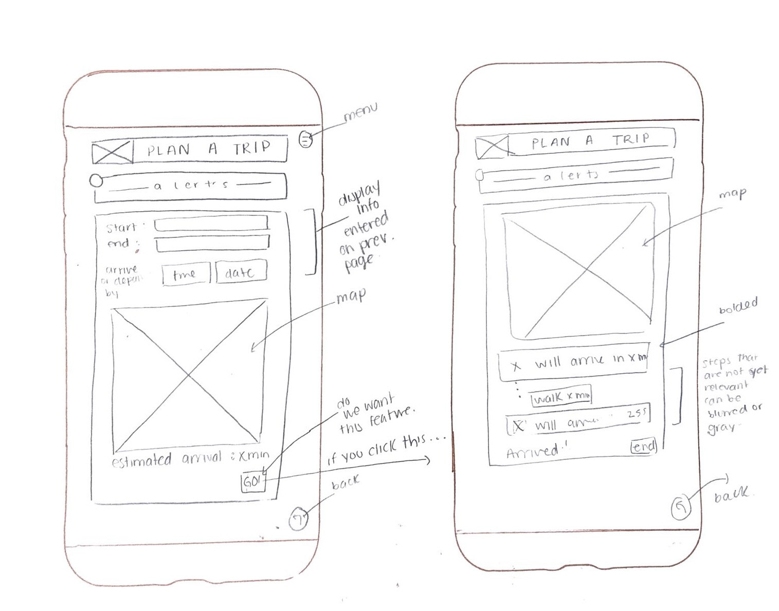
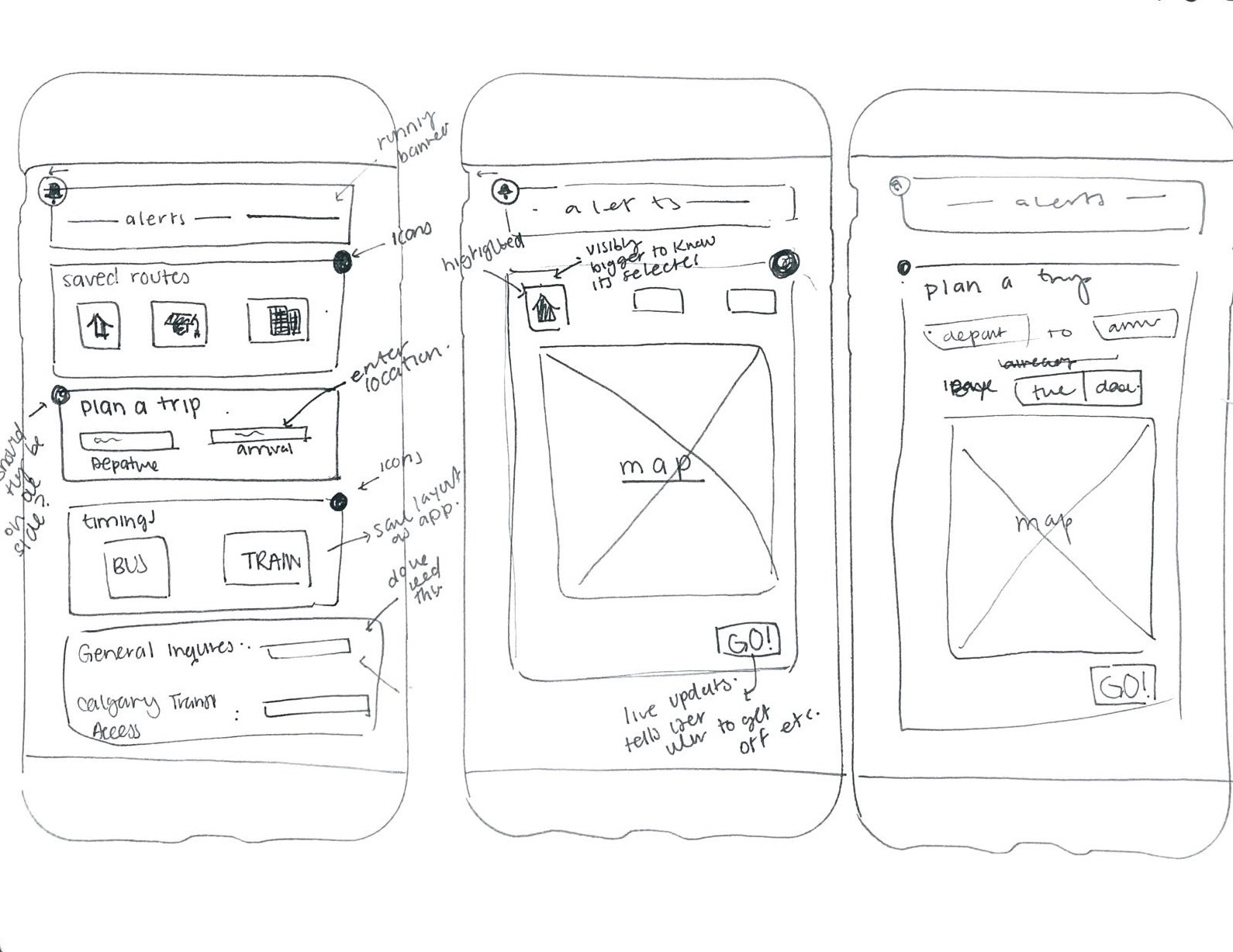
After thoroughly analyzing the MyFare MTS and synthesizing insights from the discovery phase, our team embarked on the crucial task of translating those findings into tangible design solutions. The focus was on creating an intuitive and user-friendly app interface that aligned with users' expectations and needs. Every aspect of the user journey was meticulously considered, from content placement to interactive elements.
We developed paper prototypes which involved sketching out the proposed layouts, features, and interactions on paper. By doing so, we could visually map out the app's structure, navigation flow, and the placement of key elements. These paper prototypes served as a preliminary step in the iterative design process, allowing us to evaluate the feasibility and effectiveness of our concepts.Considering the diverse range of users and their unique preferences, we paid close attention to inclusive design principles. The goal was to ensure that the app catered to a broad audience, considering factors like language, accessibility, and user preferences.
Throughout this phase, collaboration with Calgary Transit representatives remained integral. Their valuable input and insights, combined with the user-centric approach adopted by our team, contributed to the development of paper prototypes that aimed to enhance the overall user experience of the MTS
High-Fidelity Prototyping
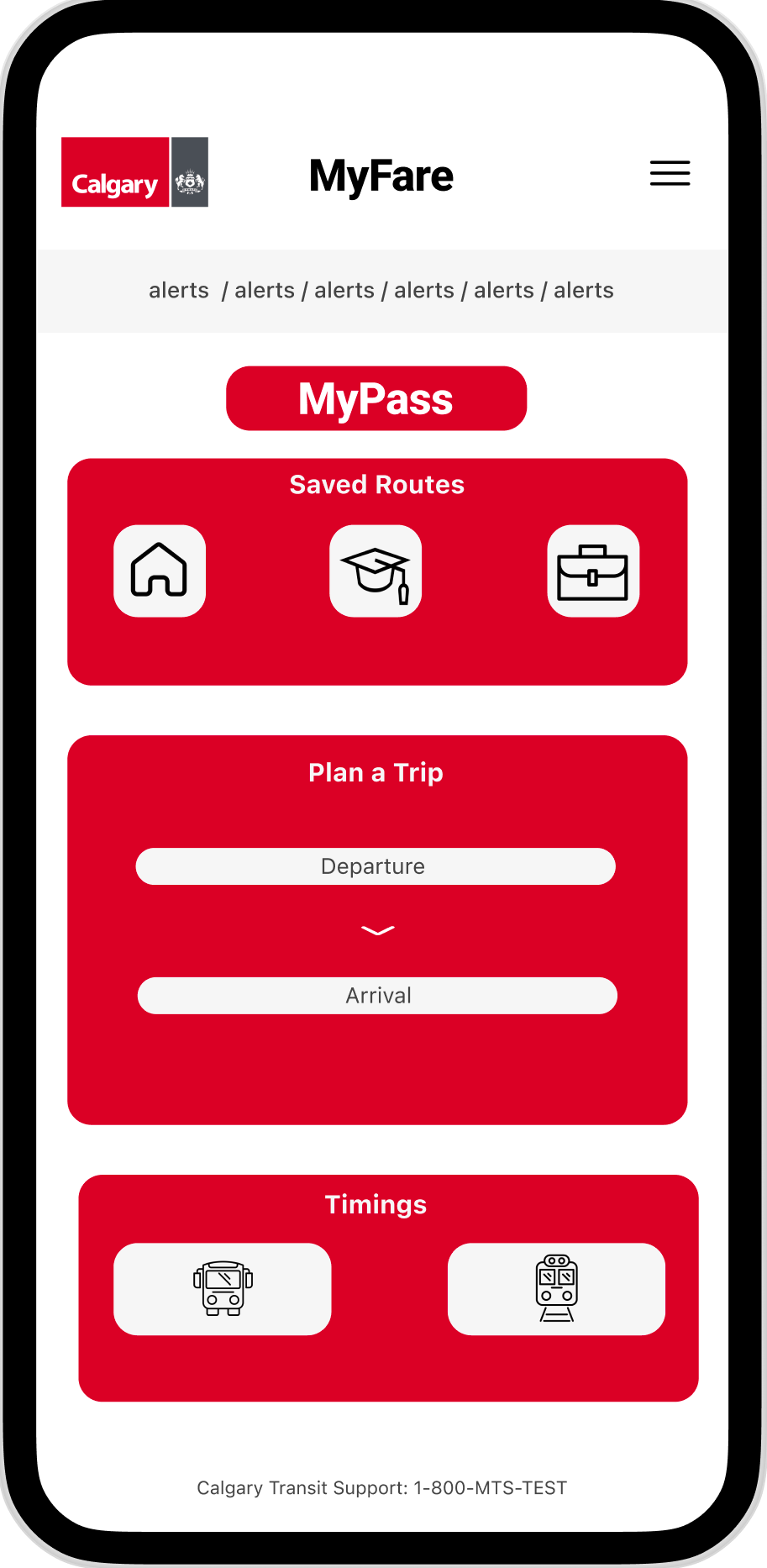
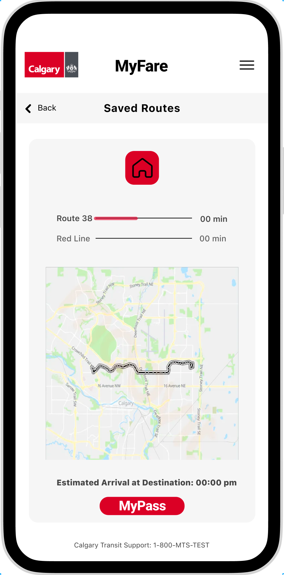
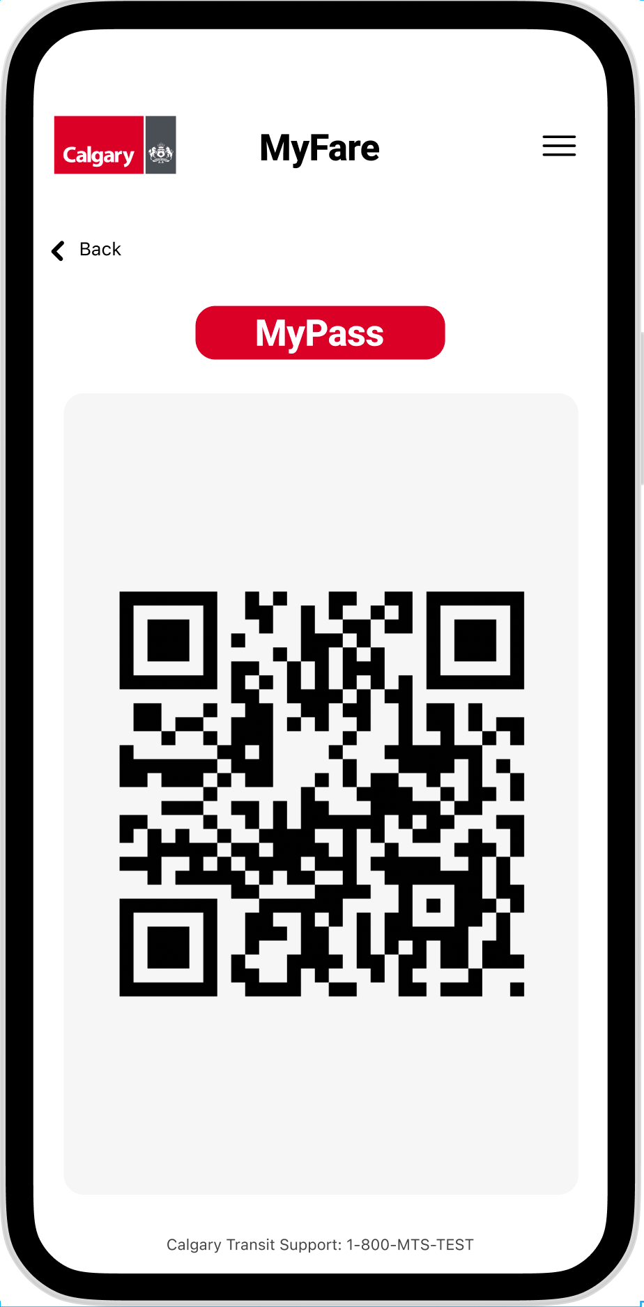
Building upon the insights gathered from the paper prototypes and wireframes, our team transitioned into the next phase of the design process — the development of a higher fidelity prototype. Leveraging design tools such as Adobe XD and Figma, we translated the sketched concepts into digital interfaces that closely resembled the intended user experience.
The higher fidelity prototype aimed to provide a more detailed and realistic representation of the MyFare App, incorporating refined visual elements, interactive features, and a polished user interface.
Preparing for the upcoming click test, the higher fidelity prototype served as a comprehensive tool for evaluating the user flow, identifying potential pain points, and refining any aspects that required enhancement. Through iterative design and continuous refinement, our goal was to create a prototype that not only met but exceeded user expectations, fostering a positive and efficient user experience within the MyFare App.
User Testing
In the subsequent phase, our focus shifted towards testing through a click test using Optimal Workshop.The click test incorporated both the app and associated marketing materials, providing a holistic understanding of user engagement with the entire My Fare experience. Participants interacted with the app on their mobile phones (iOS and Android), generating valuable data on user clicks, time on task, and task completion. Additionally, participants' comments and feedback offered qualitative insights.
By subjecting the app to the click test alongside marketing materials, we aimed to identify areas for improvement in the user interface, navigation, and overall user experience. This dual evaluation approach ensured a comprehensive analysis of the entire user journey, enabling us to refine both the app and promotional content based on user preferences and feedback and provide insights into their experience with the app's functionality, visual elements, and overall user satisfaction.
Phase 3: Synthesis of Findings & Hand-Off
Synthesis
In order to prepare for hand-off and the final presentation to the client, we meticulously analyzed the data obtained from the click test and the post-test questionnaire.
To effectively capture and communicate the insights gained, we synthesized the data into charts. These visual representations offer a clear and concise overview of user interactions, preferences, and usability scores. The charts serve as valuable tools for interpreting complex data sets, enabling informed decision-making and guiding further improvements in the design and functionality of the project.
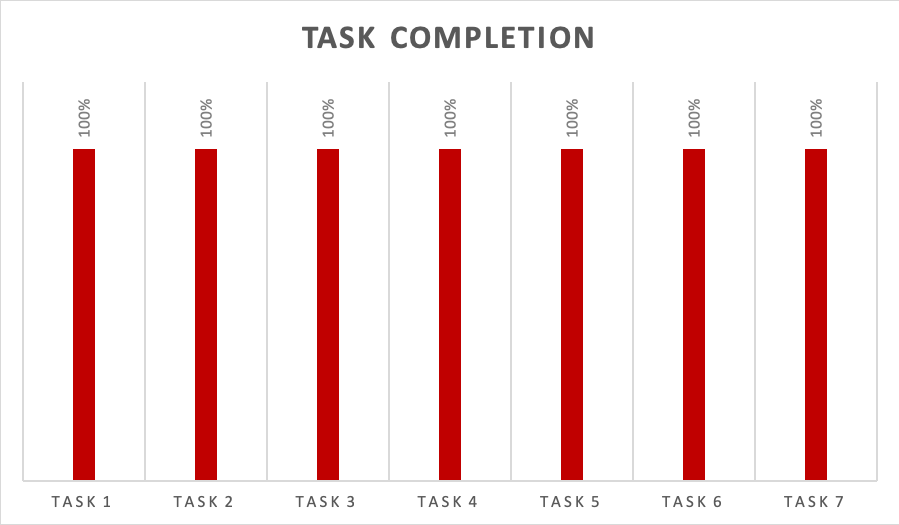
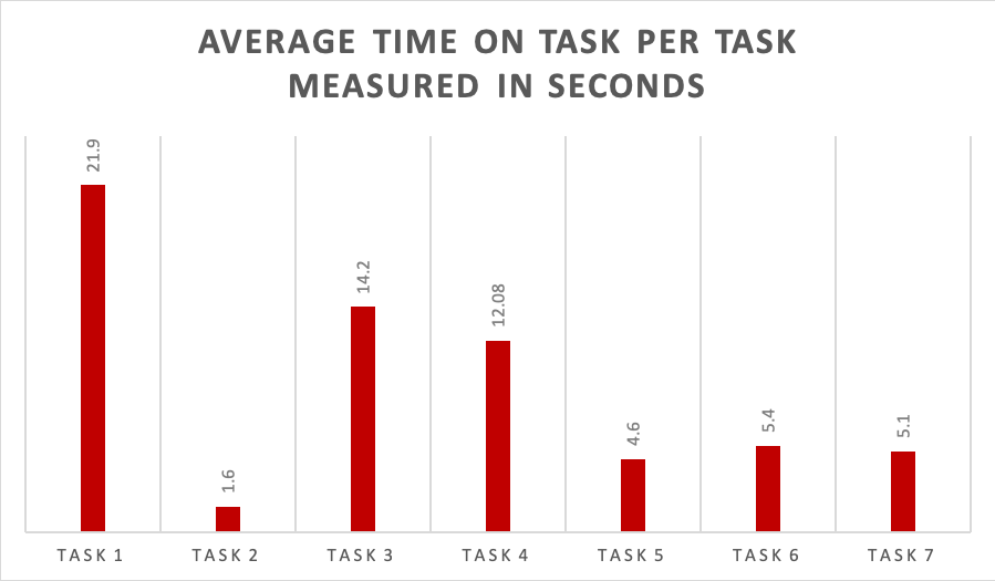
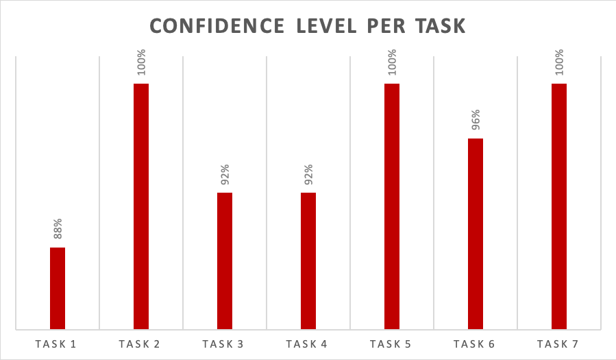
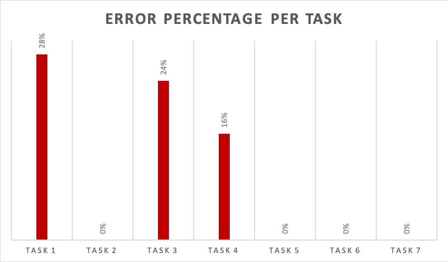
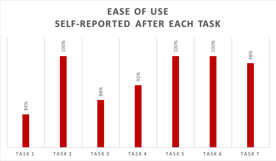
In the hands of Calgary Transit, these insights illuminate the path towards an MTS app that enriches passengers' transit experience, one commute at a time.
The culmination of field tests, user feedback, and meticulous click tests resulted in a comprehensive package of recommendations and actionable insights.
Calgary Transit, equipped with this robust data, was prepared to begin the next stage of development for its MTS. With data on user preferences, pain points, and aesthetic considerations, the city is well-positioned to refine and enhance the MTS app to better serve its 103 million annual passengers.
This handoff represents not just the end of one phase but the beginning of another—where user-centric design meets real-world implementation. Calgary Transit is empowered to leverage these insights, ensuring the MTS app aligns seamlessly with user expectations, fosters efficiency, and continues to contribute to the vibrant tapestry of stories woven through daily transit experiences in the city.
